Our Logotype
The logotype shows Hotel Co 51 as a distinct brand while hinting at its origins. There are elements common with the Vastint brand: simple yet elegant functional form (of Scandinavian descent), modern sans-serif font, dark grey / orange colour combination, and Verdana as the typeface of choice in all print and screen applications. Yet the colours have a different tint / lightness, and the font is brand new.
The circle enclosing the logotype symbolises Vastint’s holistic approach to hotels – from building to operating them.

Logotype versions
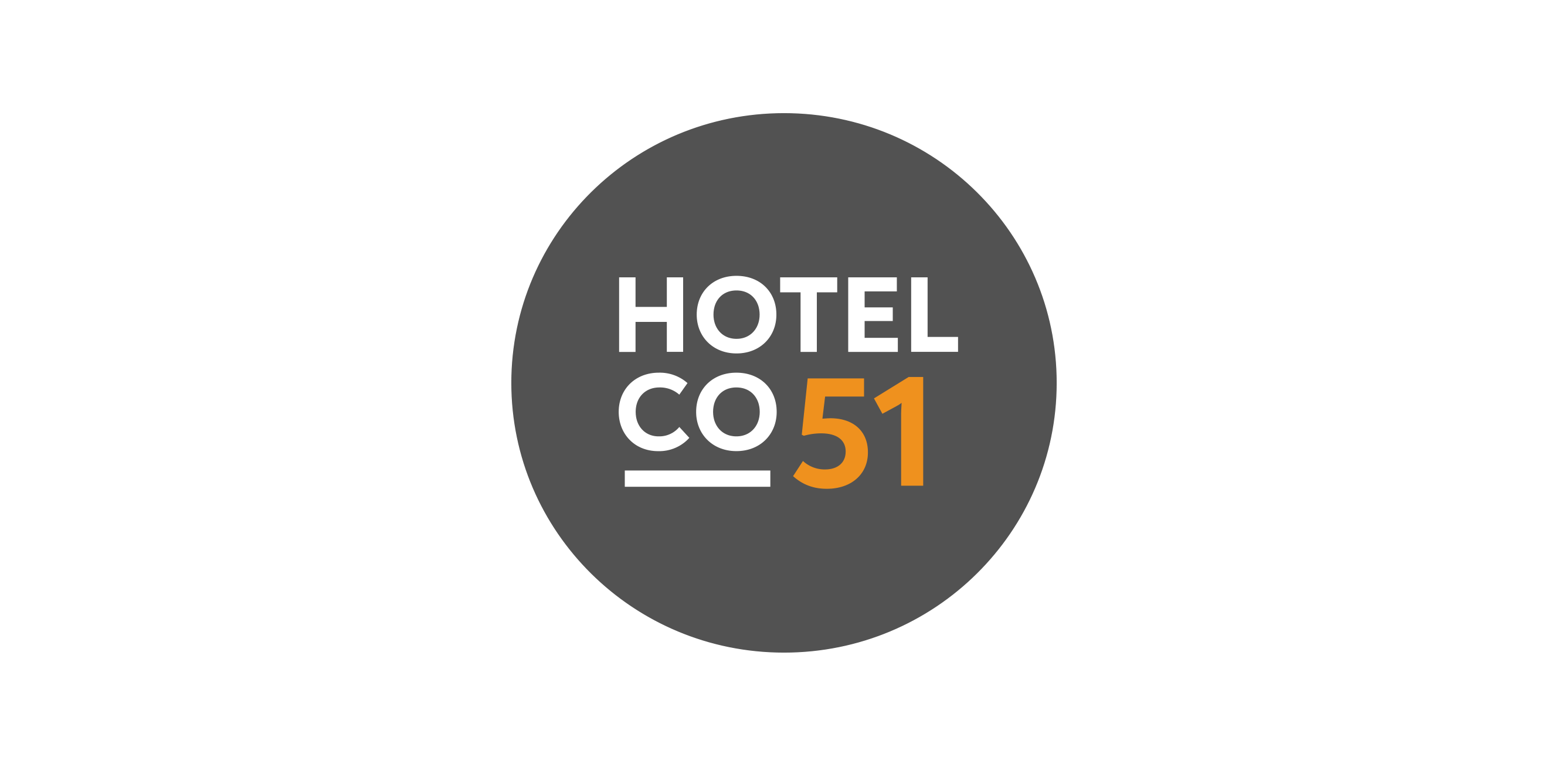
Primary logotype
The primary Hotel Co 51 logotype should be used as often as possible.
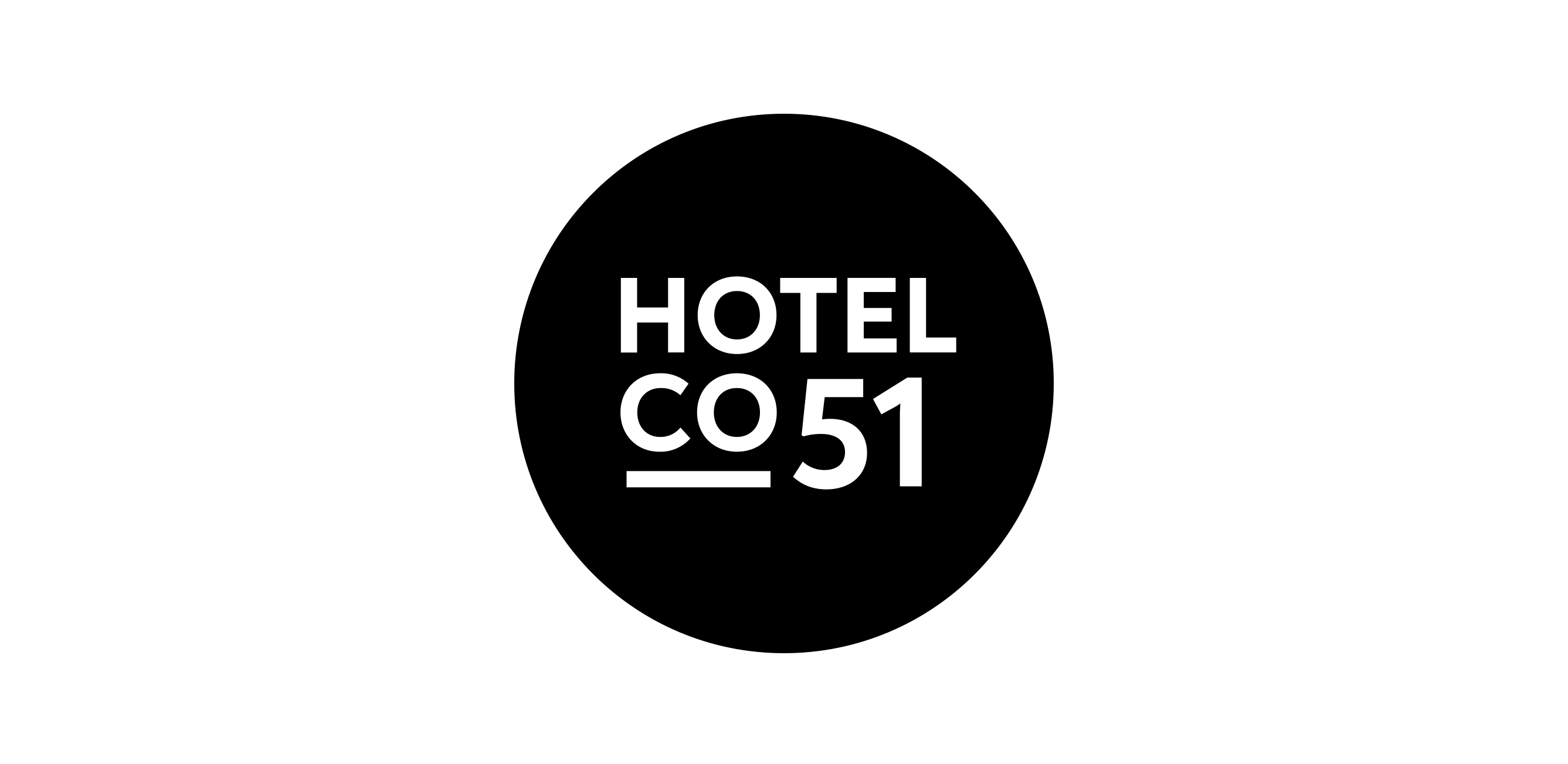
Monochromatic logotype
To be used only in situations in which the primary logo version cannot be used, usually due to technical limitations. The monochromatic logotype also serves as a shape template for various non-standard reproduction techniques, such as embroidery, stamping, engraving, glass frosting, etc.
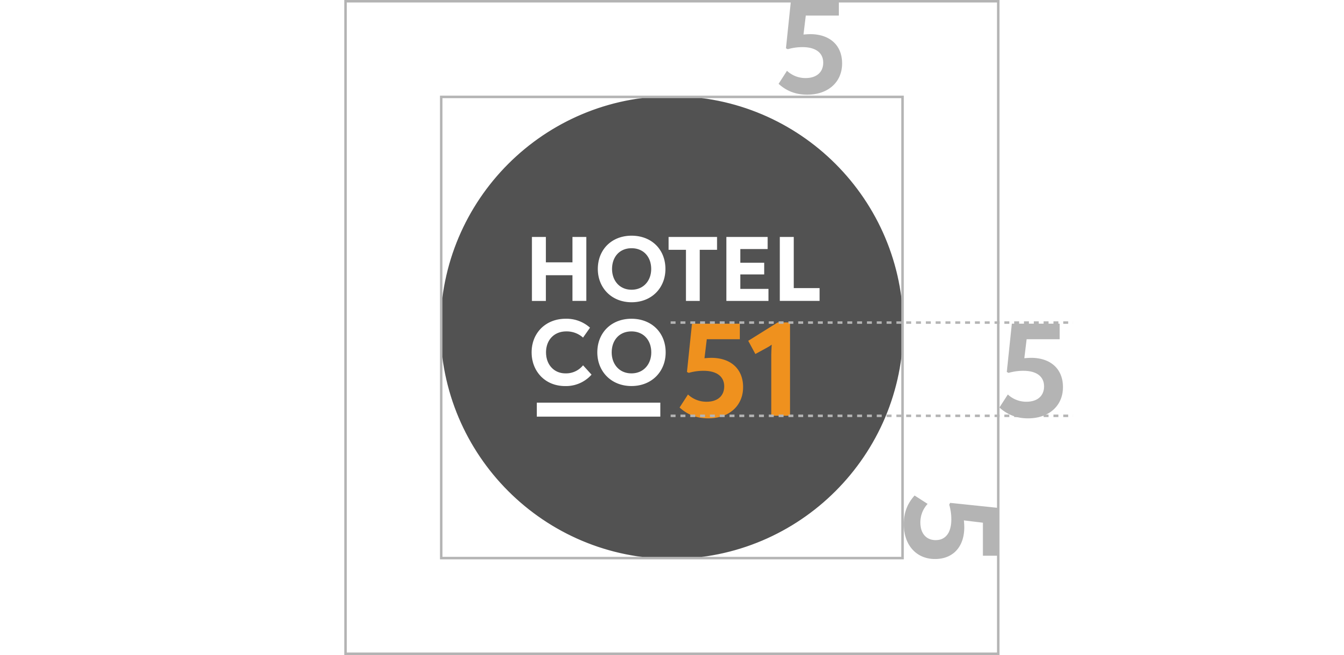
Exclusion zone
The logotype should always be placed with a margin of free space around. The minimum space surrounding the logotype should be at least equal to the height of number “5”. If possible, the space should be even larger.
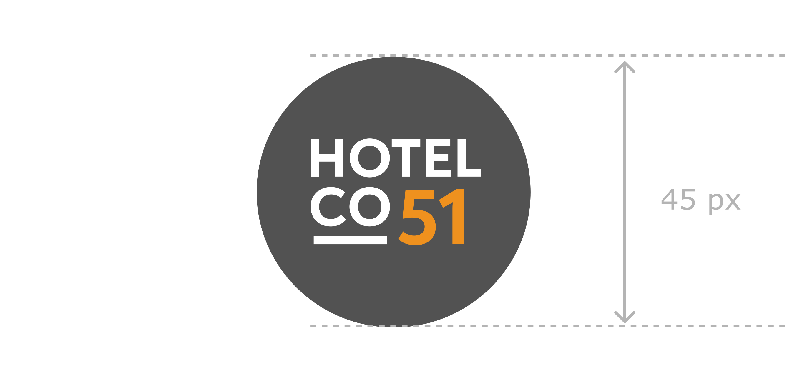
Minimum size
To maintain its legibility, the logotype should not be used in sizes smaller than described below.
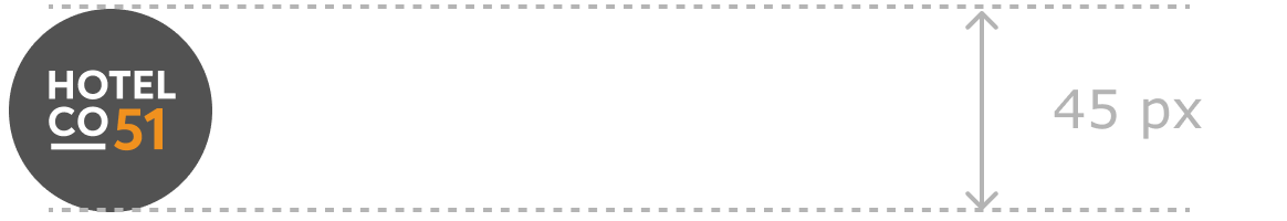
Digital use
Minium diameter for logotype reproduction in digital use (PowerPoint presentations, websites, online banners, etc.) should be 45 px.
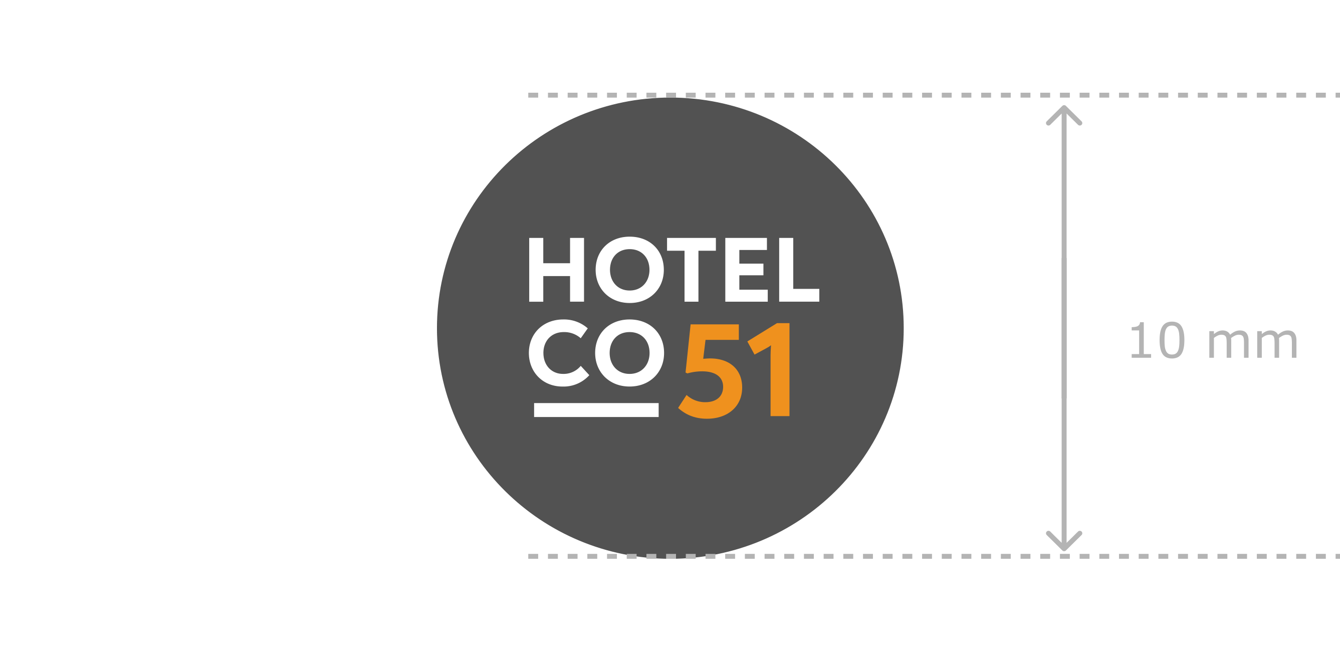
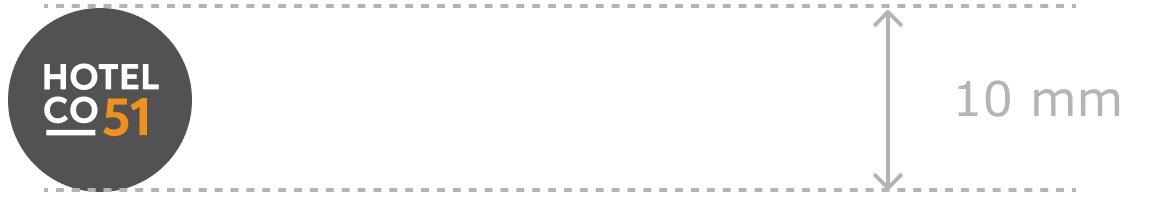
Print use
Minimum diameter for logotype reproduction in print (letterheads, business cards, office documents, catalogues, folders, etc.) should be 10 mm.
Logotype on photographs and backgrounds
The circle in the logotype adds legibility and provides good contrast, even on difficult backgrounds. Thus the Hotel Co 51 logotype may be used on most pictures and colours, as long as they are consistent with the Hotel Co 51 brand image. Caution is only needed when the background colour is close to the Dark Grey colour.
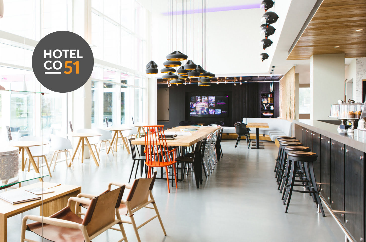
Here, the logotype is clearly legible on a light background, even with additional contrasting elements.
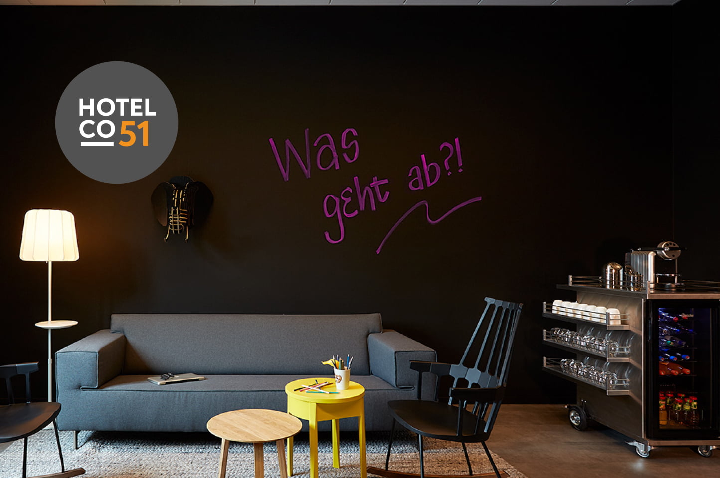
Here, the logotype is clearly legible on a dark background.
Which logotype file should I use?
digital use and printing in the office:
word, powerpoint, excel, websites, office documents, banners etc.
- Hotel co 51 logo RGB.ai
- Hotel co 51 logo RGB.pdf
- Hotel co 51 logo RGB.svg
- Hotel co 51 logo RGB.png
professional design and print:
brochures, leaflets, press ads etc. printed outside of the office, in professional print shops
for light and dark backgrounds:
- Hotel Co 51 logo CMYK.ai
- Hotel Co 51 logo CMYK.eps
- Hotel Co 51 logo CMYK.pdf
- Hotel Co 51 logo CMYK.tif
- Hotel Co 51 logo PANTONE.ai
- Hotel Co 51 logo PANTONE.eps
- Hotel Co 51 logo PANTONE.pdf
in case of technical limitations, or as a shape template:
- Hotel Co 51 logo monochromatic.ai
- Hotel Co 51 logo monochromatic.eps
- Hotel Co 51 logo monochromatic.pdf
- Hotel Co 51 logo monochromatic.tif