2.3 Vastint typography
Verdana font family should be used in all Vastint corporate materials, both in office / web use and professional print. Verdana Regular should be used for the body text and headlines, while Verdana Bold for section titles and copy highlights. Please see the table below for recommended font sizes and colours.
Verdana Regular
ABCDEFGHIJKLMNOPQRSTUVWXYZ
abcdefghijklmnopqrstuvwxyz1234567890!@#$%^&*()_+
Verdana Bold
ABCDEFGHIJKLMNOPQRSTUVWXYZ
abcdefghijklmnopqrstuvwxyz1234567890!@#$%^&*()_+

- Title / Header
Font: Verdana Regular
Colour: Black, lighter 15% / Orange
Size: 18 pt - Introduction
Font: Verdana Regular
Colour: Black, lighter 15%
Size: 12 pt - Body copy
Font: Verdana Regular
Colour: Black, lighter 15%
Size: 10 pt - Section title
Font: Verdana Bold
Colour: Black, lighter 15%
Size: 10 pt - Highlight
Font: Verdana Bold
Colour: Black, lighter 15%
Size: 10 pt
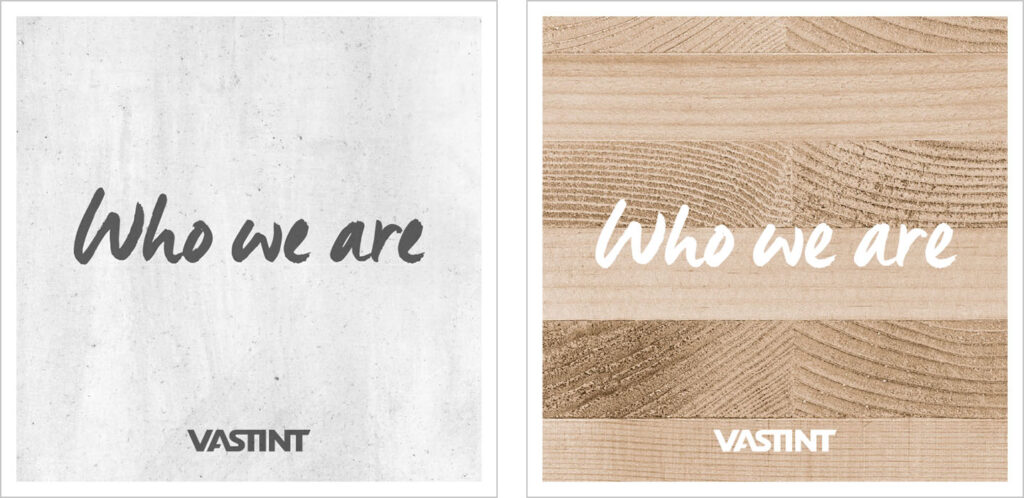
Vastint Manus font:
Vastint Manus is a script font used in headlines of Vastint marketing materials. Great care should be taken not to overuse this font – it should be used only in headers, accompanied by standard copy in Verdana font, or on quotes/statements surrounded by a large area of white space. Acceptable colour combinations are:
- white text on Vastint Grey background;
- Vastint Grey text on concrete background;
- white text on contrasting image background (see report covers);
- Vastint Orange + Vastint Grey text on white background.
See below for examples of correct use of this font. Please remember to:
- use only allowed colour combinations (see above),
- not overuse the font in the layouts.
Please contact Vastint marketing department to receive a copy of Vastint Manus font.